
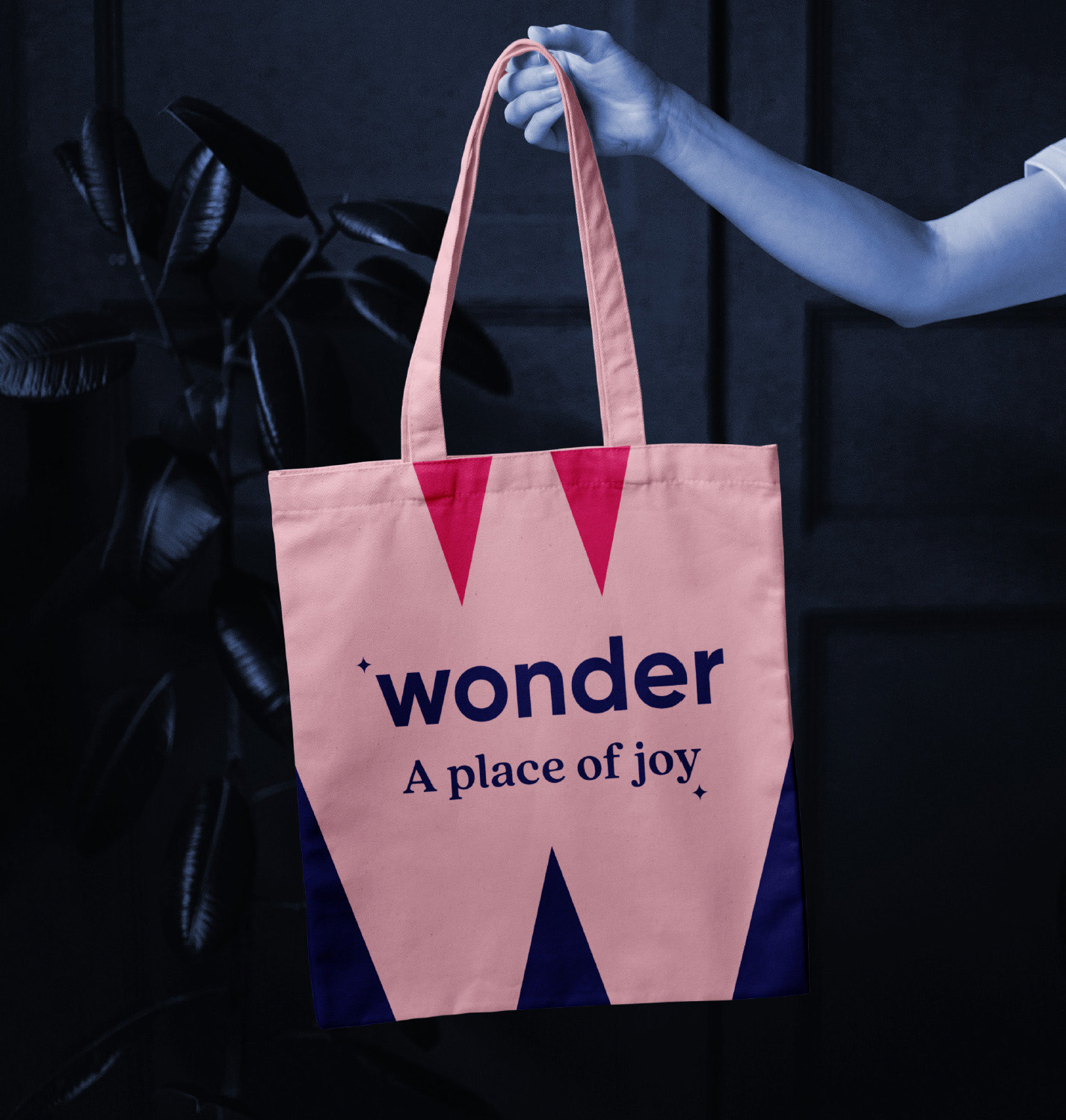
I was asked to develop concepts for a theatre re-brand in collaboration with another designer. I created the name, graphic elements, typeface pairings, character illustrations and colours here. I landed on the idea of a 'place of joy' so created assets and styles based on this concept. The brand elements and touchpoints needed to be engaging, fun and family orientated. To be seen as a place of entertainment for all.
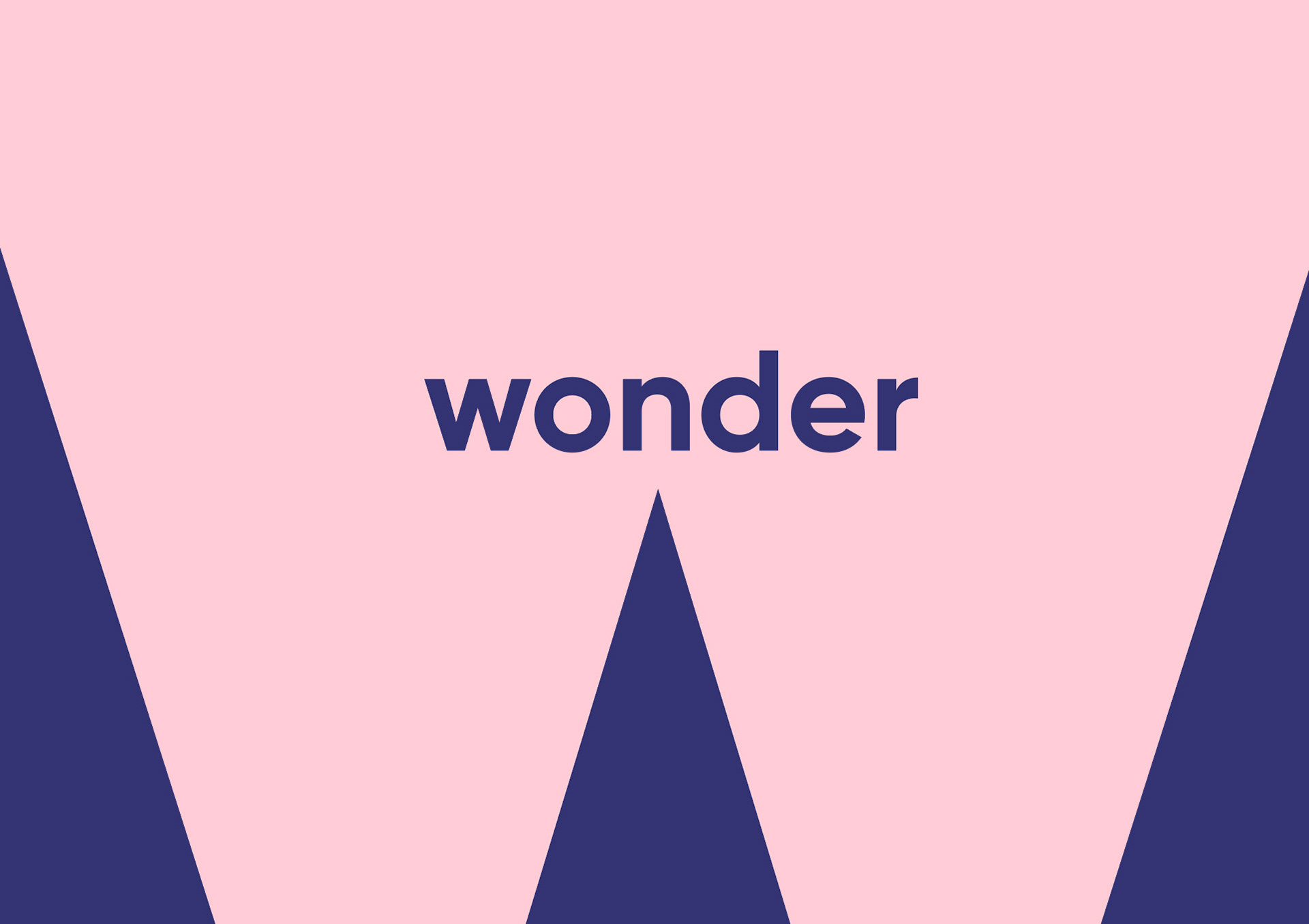
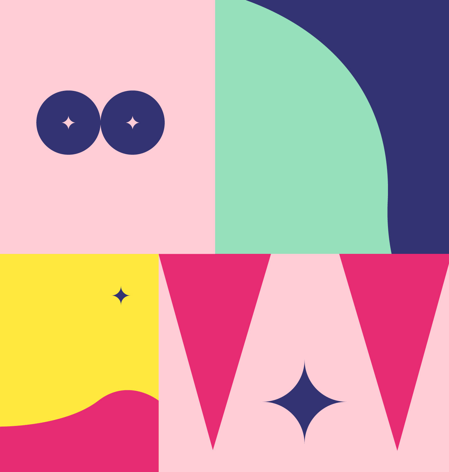
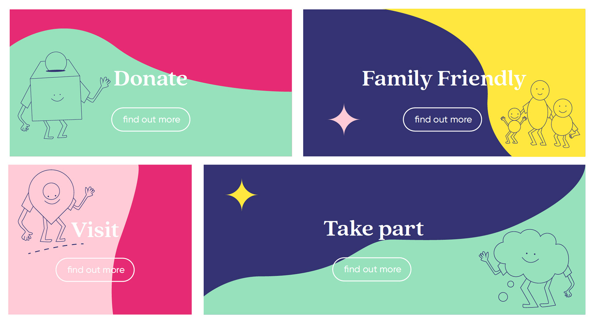
The layouts are a collection of the negative areas of the W to create a nod to bunting and circus elements. The circular ‘eyes’, are to show the 'wide eyed' expressions of the audience. The waves are an abstract way of showing the audience/entertainment participation. Also a nod to
‘waving’ instead of clapping for the hard of hearing.
‘waving’ instead of clapping for the hard of hearing.
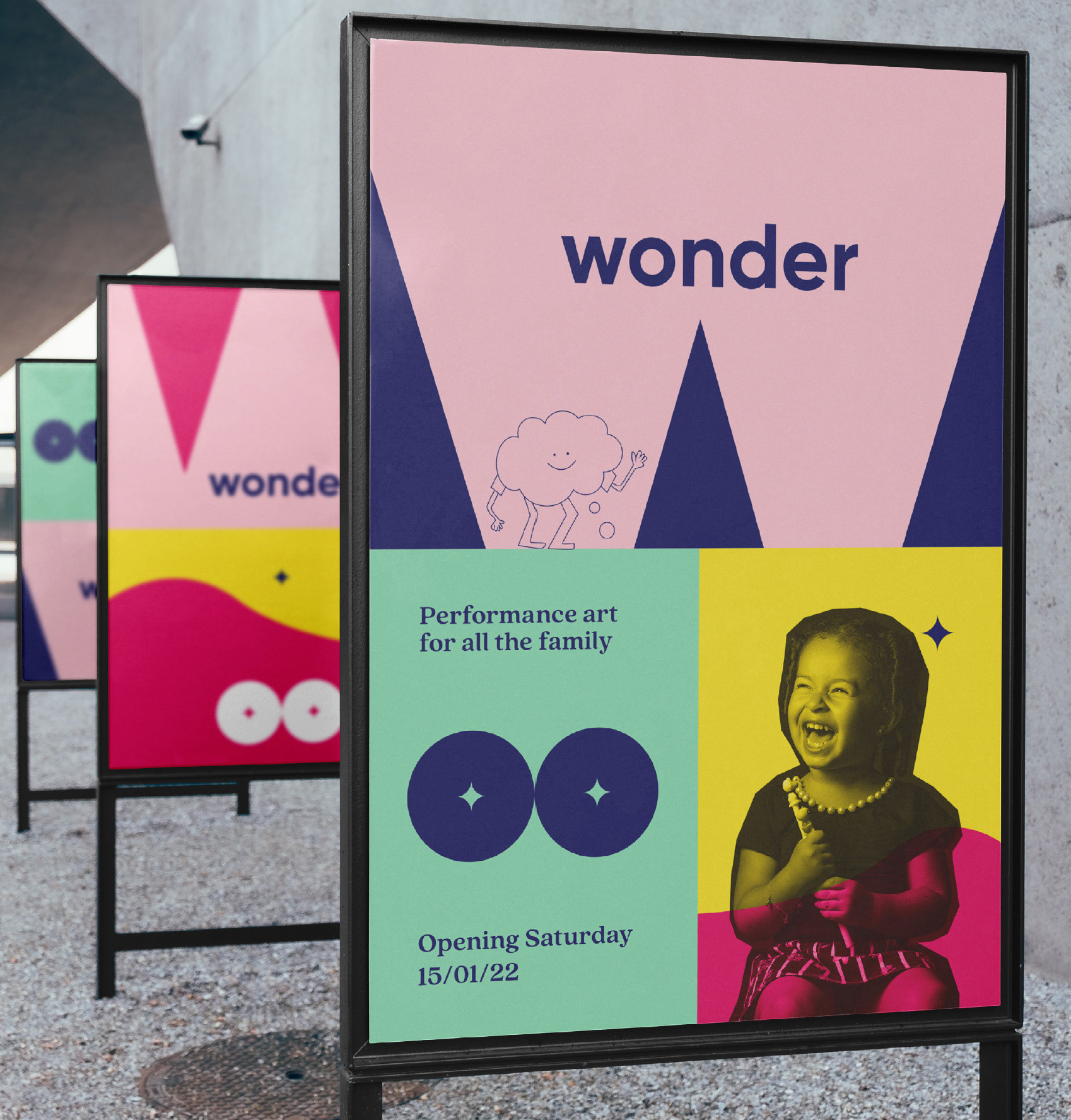
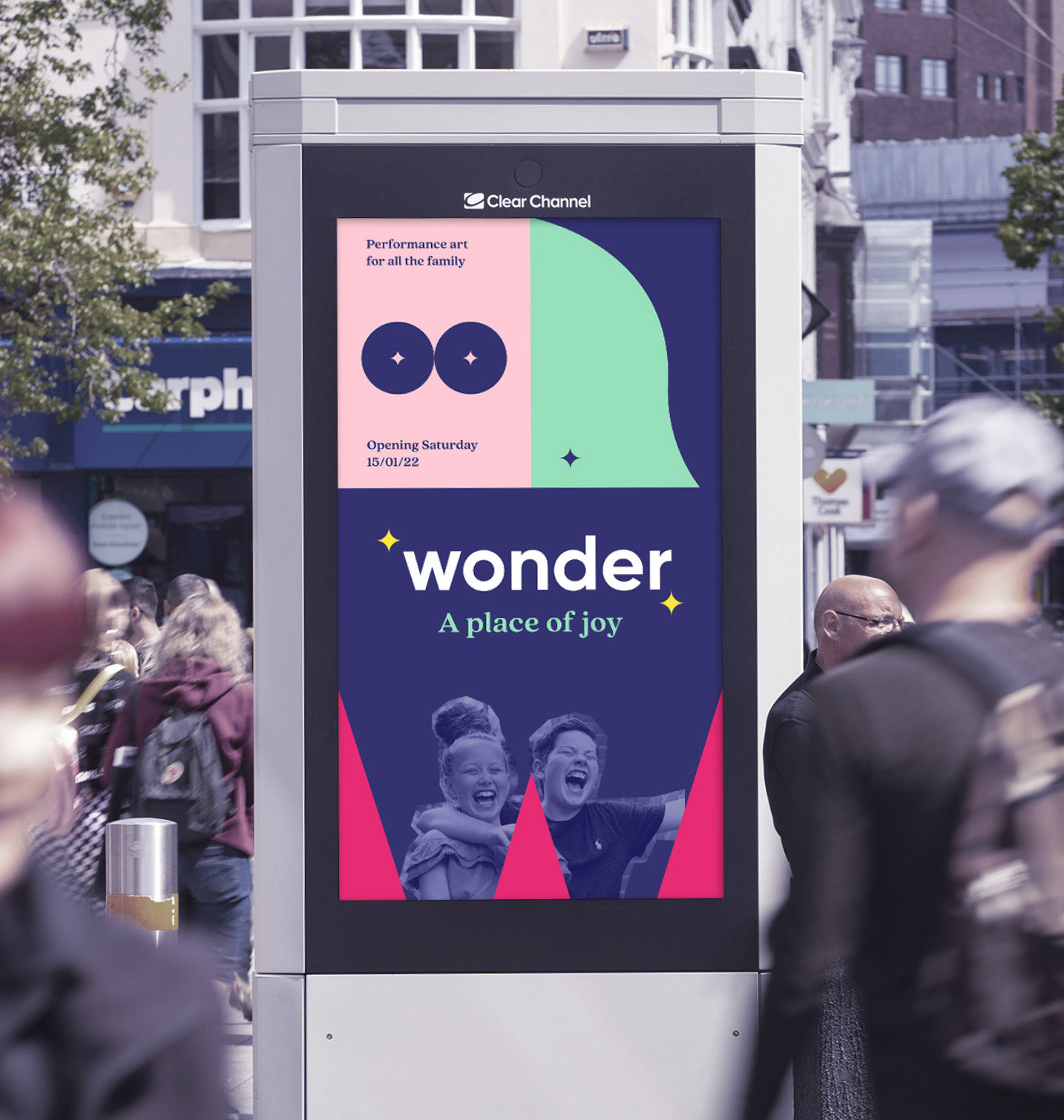
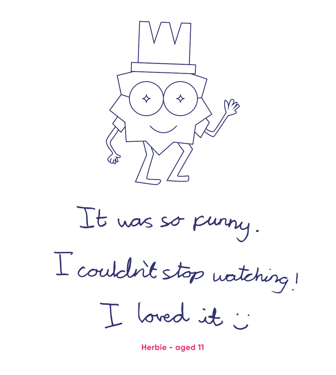
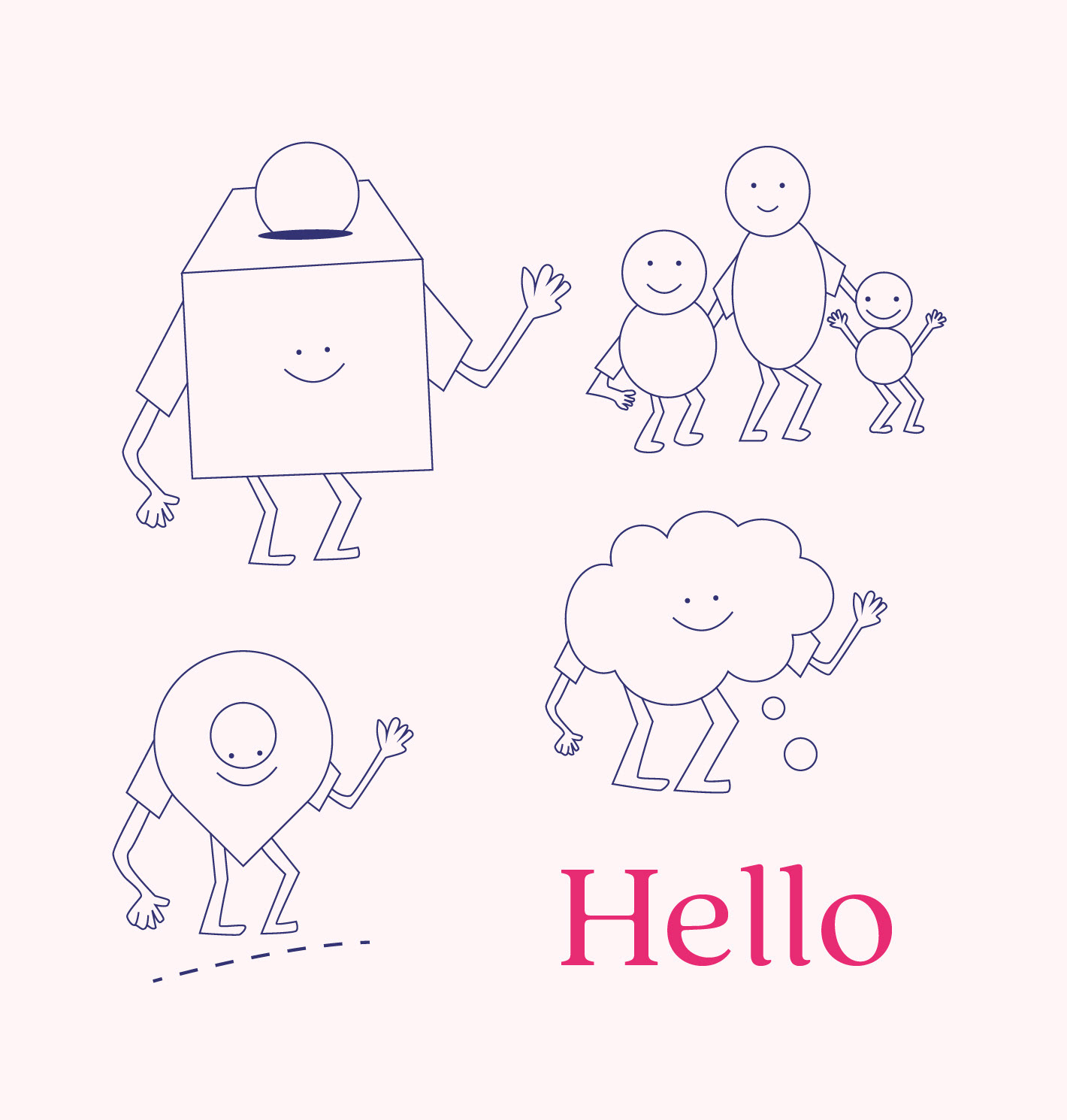
The expressive images and illustrations plus adding reviews from children add another family friendly dynamic. The character illustrations are used to add personality to the brand. So simple icons include arms, legs and a smile to bring a ‘human’ element to them. The arms are always waving to look approachable and friendly.
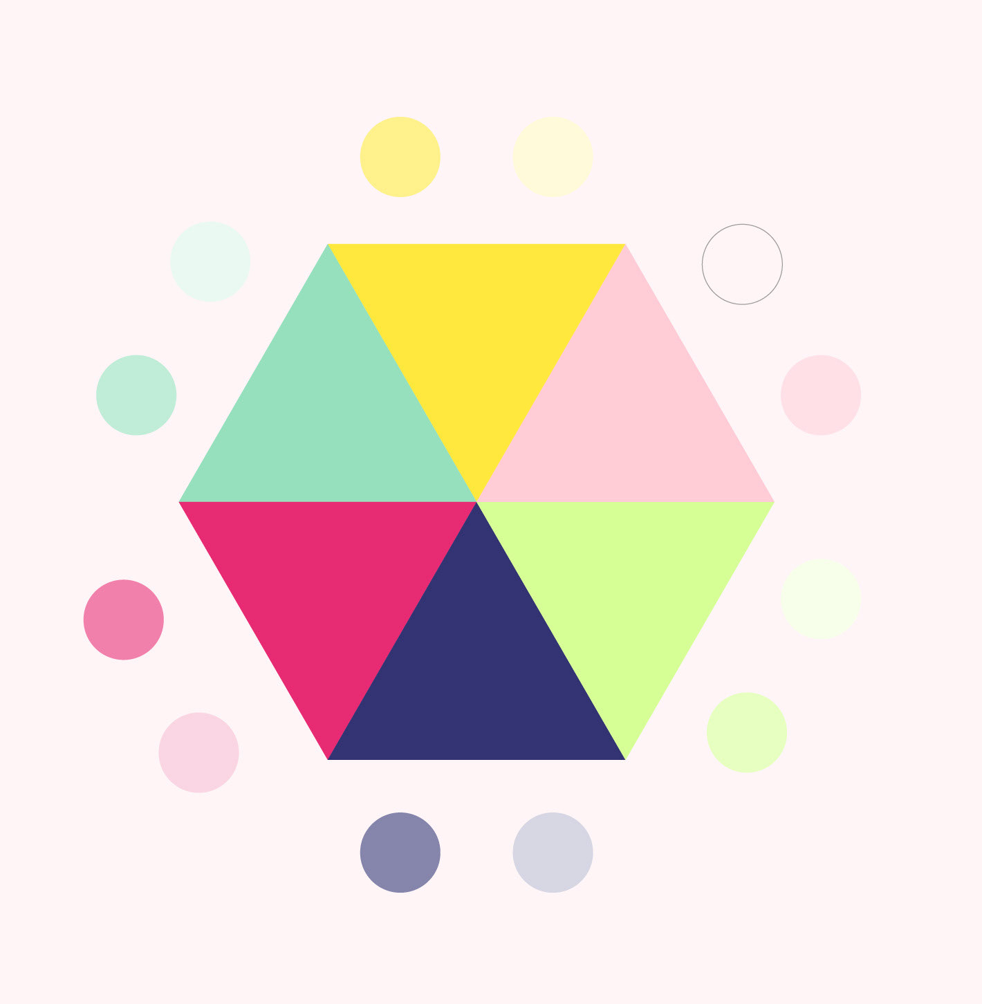
The colours are bright and cheery and work in harmony with the strong
type styles and graphic elements.
type styles and graphic elements.
Project concepts were in collaboration with KL Studio klstudio.co.uk