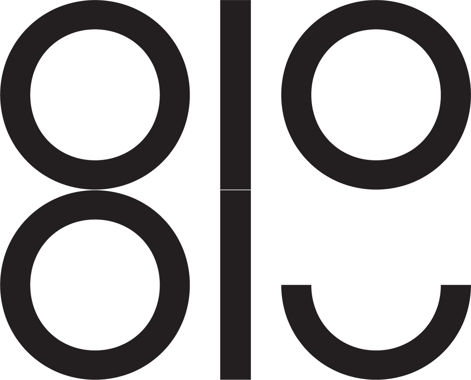
Freelance Folk Branding
I was asked to create a logo for the meet-up group Freelance Folk. Initially I did four concepts which answered the brief in different ways. The chosen concept stood out as current and approachable—keywords which fit the aspiring and expanding meet-up. The design uses the ; glyph (a wink in social media terms) as a cheeky addition to sections of the type to make it cordial, not too corporate but still professional. I go along to the meet-ups and regularly see all types of people but the common ground is that the group is friendly and professional. For social media icons the logo was reduced to FF which is a nod to the face-to-face aspect of meet-ups for freelancers. It can be a lonely role as a freelancer and 'getting together' was a key part of the design. I thought the colour palette needed to be bright and cheery to reflect the inviting nature of the group. The colours work harmoniously and are strong enough individually to have a good selection of options. See more info on the brand here: https://www.freelancefolk.co.uk/blog/creating-a-new-brand-identity
